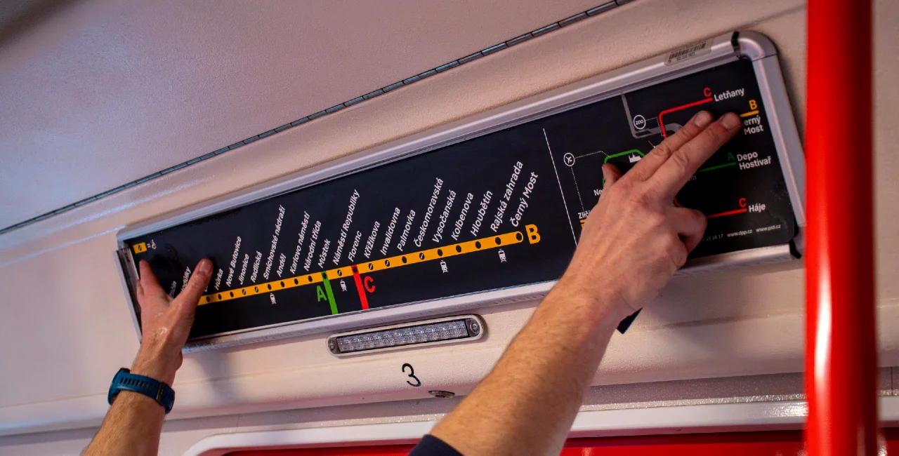
Residents of, and visitors to, the Czech capital will very soon see new metro maps as the city replaces its current line diagrams with new, black-themed signage. The changes, part of the city’s ongoing “Legible Prague” initiative, are set to roll out at the turn of the year.
The new design features two types of signs above each pair of metro doors. One displays a comprehensive map of all three metro lines, while the other provides a detailed view of a specific line. Both are overlaid on a black background, and the Prague Public Transport company trialled both new versions to the public in early 2024. Additionally, some doors will include expanded network maps highlighting central Prague.
“Passengers preferred the [new] scheme version with all three lines, but we decided to use both types so everyone can choose the option that suits them best,” the Ropid organization, in charge of Prague’s public transport, said in a press release today. Icons for key landmarks, such as the Old Town Hall, Vyšehrad, O2 Arena, and Prague Castle, have also been added to the three-line maps.
Co bylo také upraveno oproti testovaným variantám?
— PID (@PIDoficialni) December 23, 2024
- ZvÄ›tÅ¡ené pÃsmo i zarovnánà názvů stanic do jedné linie u trojlinkové verze
- Nový srozumitelnějšà symbol bariérovosti stanic
- Přidané dalšà důležité body zájmu (Staroměstská radnice, Vyšehrad, Arena Praha) pic.twitter.com/EJh00qNV4R
The redesign (nicknamed the "dachshund" for its long appearance) incorporates feedback from extensive passenger surveys conducted this year. The updated signs feature larger fonts, improved symbols for barrier-free access, and highlighted transfer stations. “The basis of the Legible Prague project is its development with the general public, because the system serves them,” said Ropid director Petr Tomčík.
Deputy Mayor for Transport Zdeněk Hřib emphasized the collaborative nature of the Legible Prague project, which has been in development since 2017. Testing of the new signs has been ongoing across three metros on each line, as well as at the Palmovka, Jiřího z Poděbrad, and Chodov metro stations.
The new design has drawn mixed reactions on social media, with some passengers criticizing the aesthetic. However, Ropid maintains that surveys show improved readability, particularly for visually impaired passengers. The design also allows for future updates, including the integration of the currently under-construction D line.
Other examples of changes spurred forward by the Legible Prague project are new pedestrian information signs and updated, clear-to-read maps on streets with points of nearby interests displayed upon them. This is part of the city’s aim to create a new uniform navigation system across the city's streets.


 Reading time: 2 minutes


