The Prague 3 district has launched a new logo as part of a rebranding campaign, but unsurprisingly it has been hit with a lot of criticism both for its cost and its look, which many have compared to an old-school pub tally sheet.
The Prague 3 district includes most of Žižkov and parts of Vinohrady, Vysočany and Strašnice.
Jakub Vaněk and Barbora Micajová from Jakub Vaněk Studio won the anonymous two-round competition for the new look, beating 80 other entrants. The prize for winning the contest was 350,000 CZK, while the second and third place entrants received 40,000 CZK and 30,000 CZK respectively.

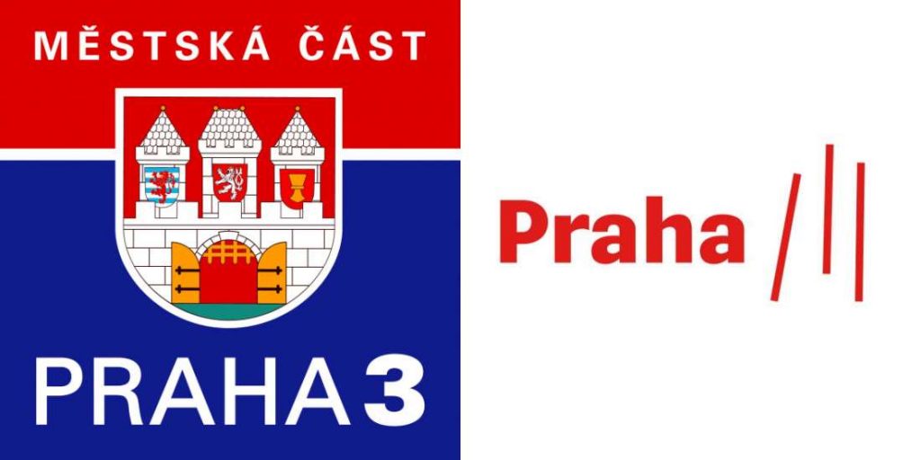
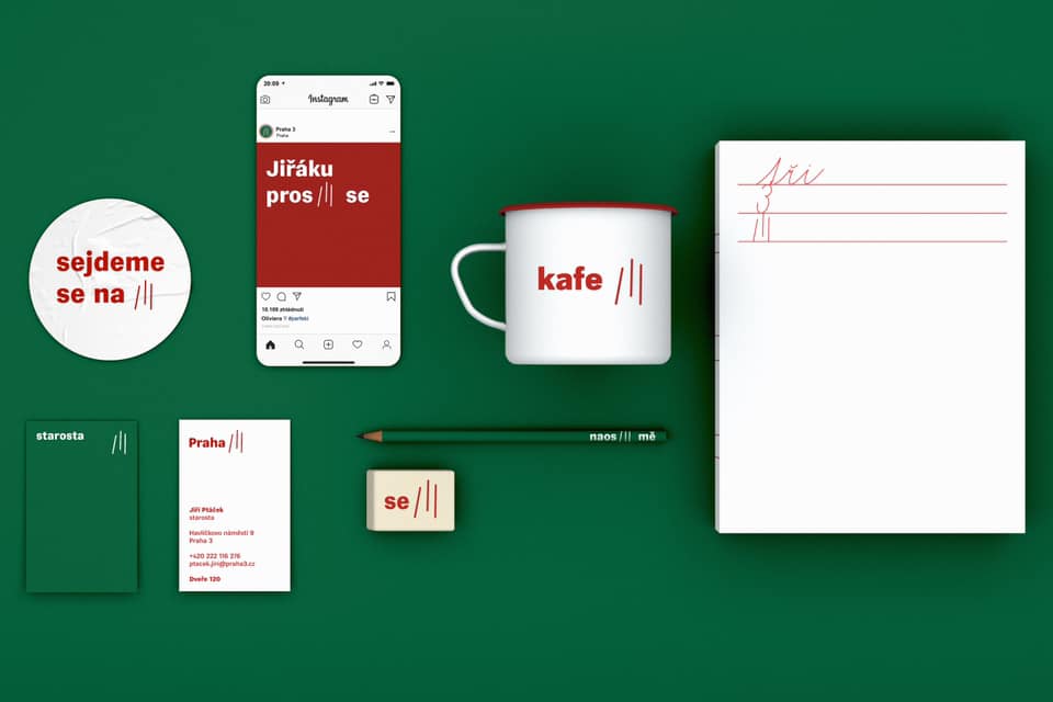
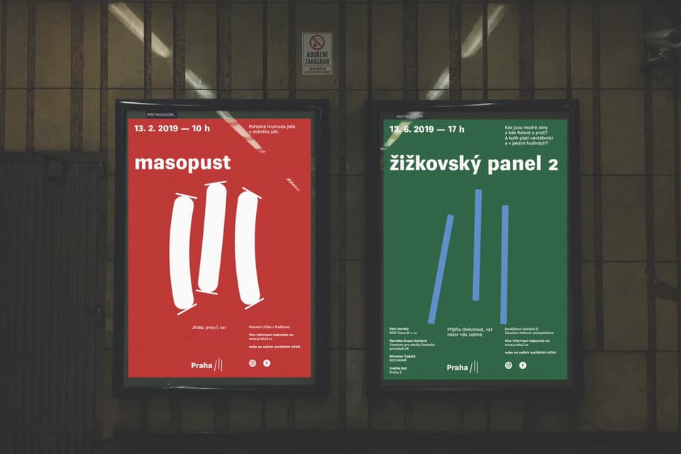
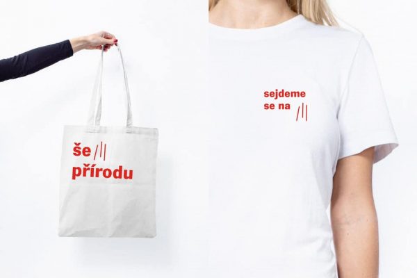
Their logo has the world “Praha” in red, and three skewed lines to represent the roman numeral for three. The font used for the logo is vegan sans semibold. The logo will appear on cups, cloth bags and other items as well as being used for official purposes.
The district administration said the old logo was outdated, and the new one represents the district as it really is. The old logo featured the district shield, with a city gate, two lions and a chalice. A red field above the gate said “Městská část” meaning “city district” and “Praha 3” was in a blue field below the gate.
The Prague 3 administration said the new logo works with the symbol for “three” in the original and contemporary concept. The jury was impressed by a comprehensive, thoughtful and quality workmanship. At the same time, the three has a great potential for communication with the public and offers a wide variety for online use, they added.

“There were a lot of proposals. We agreed unanimously on the winner. We were touched by a fresh and memorable style and the possibility of further work with the idea. We are very pleased that the authors are young people who have a clear relationship with our city district,” Prague 3 Mayor Jiří Ptáček (Top 09 / STAN) said.
“The memorable style and the possibility of further work with this idea appealed to us. I would like our new logo to be used more widely than the old one. We publish a lot of materials that bear the identity of the district. The application will be wide —on letterhead on letters, on our promotional materials, social networks, websites or in printed Town Hall newspapers,” Ptáček added.
The winners explained their design when it was unveiled recently. “Our goal was a relaxed, human and simple visual style. Such that the inhabitants of Prague 3 mastered it and continue to live their lives. Today’s appearance of Prague 3 provides a diverse range of meeting places that push life into the streets,” Jakub Vaněk said.
“So we based our identity on meeting places and interpersonal relationships. These are the places that connect, blurring the differences between the old woman from Žižkov, the gravedigger from the Olšany Cemetery and the director from Vinohrady. They are memories – first date, place for creation, morning coffee at the newspaper, neighbor card, first visit to the cinema or watching the World Cup,” he added.
Some people complained that the prize money could have been put to better use in the district, and that it was too high considering the results. CzechDesign, which organized the competition, defended the outcome.
“Prague 3 had the potential to attract many candidates, so we were not afraid to choose the open competition format. Many established studios, as well as young authors, have applied. The result of the competition is not only a logo and logo manual, but a complex visual style that includes many outputs and hundreds of hours of work. The end of the competition is the start of long-term cooperation. Thanks to this, the new visual identity will translate into official communication of the city district, communication on social networks, town hall newspapers, posters, leaflets, several promotional items,” Czech Design’s Jana Vinšová said.

Reaction from social media was swift, with people posting parody images and others asking if it was a joke. One replaced the three red lines with three smeared bloody fingerprints, resembling something one might find at a crime scene. Several people including Reflex magazine did variations on three lines of white powder on a dark background.
Still others thought it was too close to the Adidas logo of three parallel lines, resembling an attempt at knock-off sneakers. Falling dominoes was another association. It was also noted that is resembled film posters, such as Jurassic Park III. It also looks like the logo for the Czech band Tři sestry and an icon on Spotify.

“Did anyone think of beer?” one person stated, noting the resemblance to a pub tally sheet. Others; though, said that was appropriate for Žižkov. Another person made a proposal for a Prague 6 logo, with six beers ticked off on a paper.
Beer was the most common criticism. “And this is a symbol representing the city district famous for [Jan] Hus? The symbol of the place where a hi-tech transmitter building stands, a famous monument in Europe, [and where] there is an artistic tradition? This looks more like Žižkov is one big pub where the primitive drunken staff can’t write three lines properly. Or is there another meaning?” Jakub P said.
“Is there a link where you can see the designs that lost to what looks like the logo of the mathematics circle for preschoolers? It had to be approved only by someone who is not originally from Žižkov … or had nothing better to choose from,” he added.
Daniel H also took a dim view. “Oh, God, it’s***, and it talks in the article about quality. … Well, the idea of branding [Prague 2] as a ‘meeting place’ with 3 lines? Prague 3 is full of monuments and specific buildings, and is this the final output? What are you sniffing there? Minimalist trends worthy of first-year hipster graphic designers. So congratulations for a good portfolio reference,” he said.
One Facebook user blamed the Pirate party, even though that group is not in power in Prague 3. “500,000 [CZK] for three lines? Well this is brilliant business! The world has gone mad!! But since the neo-Marxist Pirates have ruled Prague, nothing will surprise me. Just further waste,” Petr P said.
But some people liked it. “Haters gonna hate. … When the Studio Najbrt made a visual identity for Ostrava for 1.8 million CZK, there was an uproar. Today after 12 years everyone knows that ‘!!!’ means Ostrava, and it is one of the best and most popular logos. The best are the graphic design experts who claim that the painting took 5 minutes,” Jana V stated.
But still another person thought the three lines for Prague 3 and the three exclamation points for Ostrava were too similar and would cause confusion.
Prague 3 is preparing an exhibition of all of the entrants. It will take place at the Prague 3 info center at Milešovská 1 starting February 3.


 Reading time: 5 minutes


